Fearless John

Full Circle Case

Ortho Herentals

A strong reputation, built over the years. The brand just didn't show it yet. So we went full circle: strategy, identity, film, website and social.

The story in four chapters.

Get our brand ready for where we're going.

The call

Not because we want more patients, but because today we don't project what we've built over the years: a strong reputation, expertise and trust. It was time the brand finally told what Ortho Herentals had long been.
No half measures.

The dare

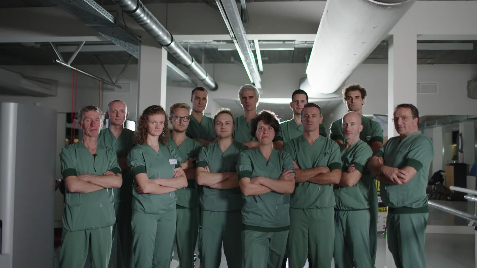
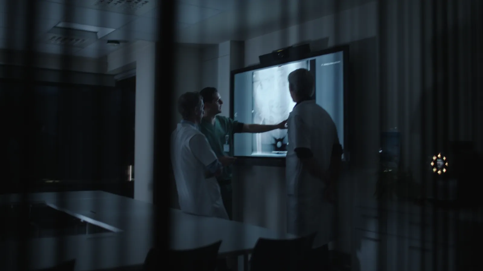
We spent a full day around the table with all the specialists. Not for a noncommittal brainstorm, but for fiery discussions about values, standards, positioning, mission and vision. Culture lays identity bare. That became our foundation.

From that identity we created a new story.

The payoff

We translated values, mission and vision into razor-sharp yet approachable, inspiring language. The new logo rose from the old one with a more dynamic, modern look. We developed a brandbook, produced an image film that immediately earned an award nomination and built a fresh, future-proof website.

And because a brand only lives when it moves, we also took over the full social media management.

  • Brand strategy
  • Brand identity
  • Graphic/print design
  • Video
  • Website
  • Social media

Nowhere in our communication plan did we take the beaten path.

The fearless

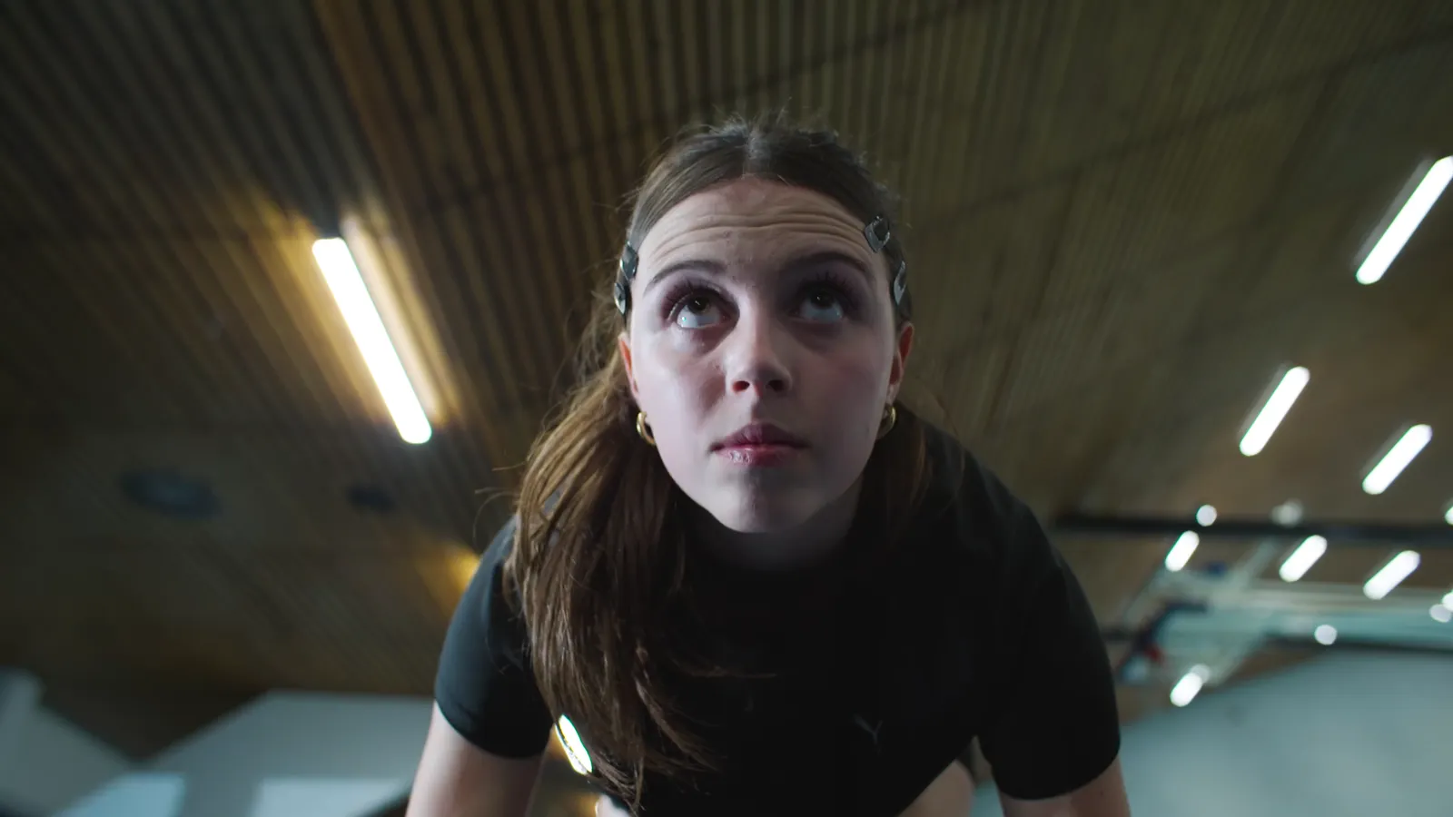
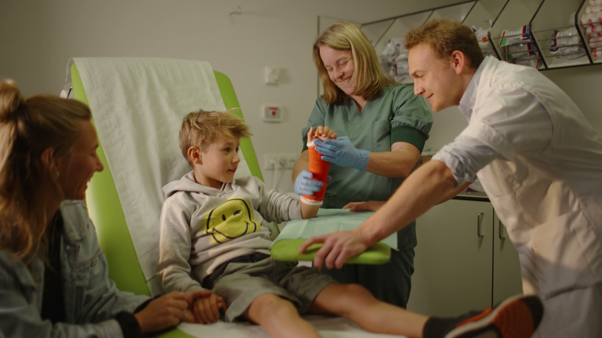
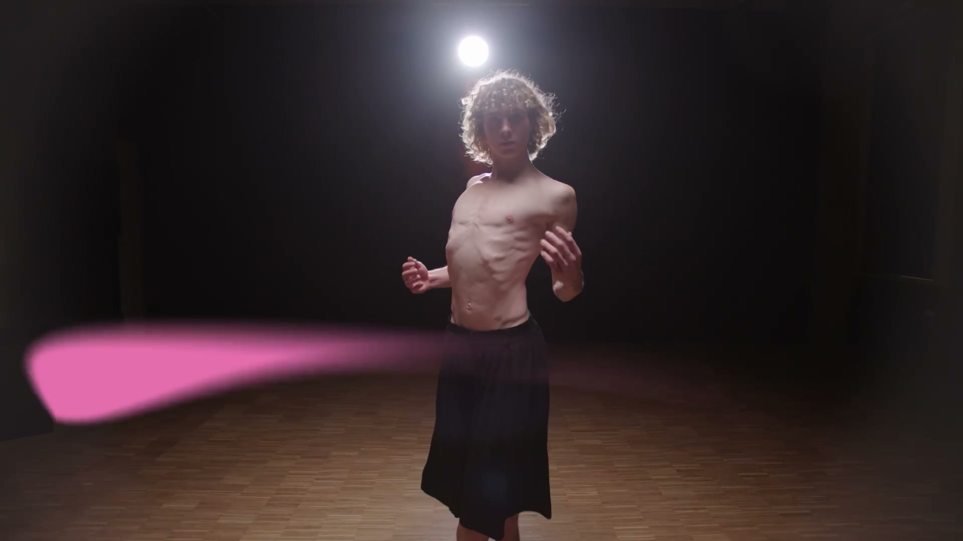
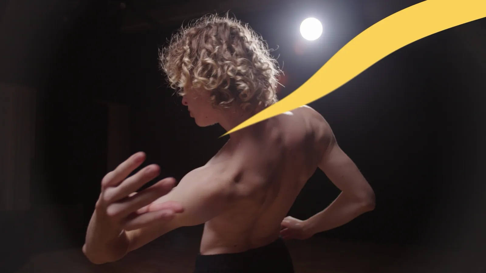
From “life is movement” we wrote a story with character. No classic testimonial with hospital footage, but an image film full of movement and experience. No cautious rebranding, but a sharp new identity. No makeover, but a whole new face for a brand that had long had something to say.

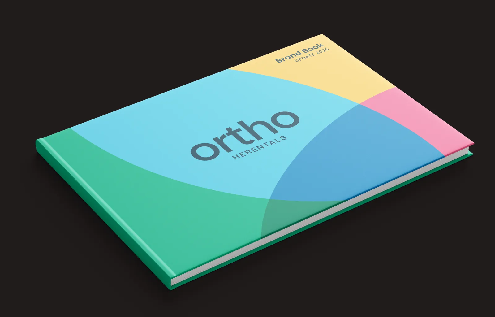
The brand book, closed: the cover with the wordmark on the five overlapping colour fields and the line Brand Book Update 2025.

Brand identity

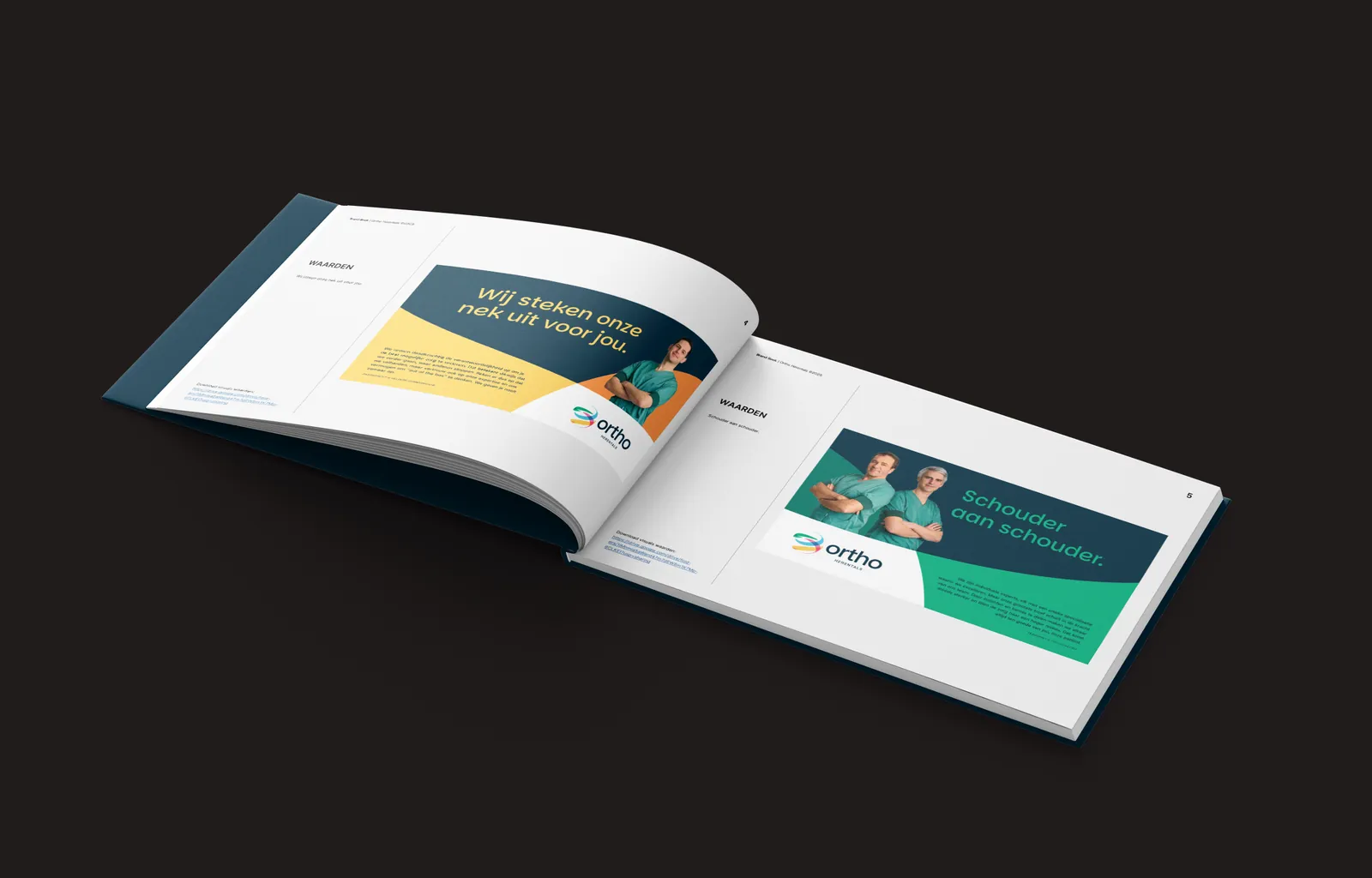
The brand book open at the values: the spread Wij steken onze nek uit voor jou and Schouder aan schouder, each with a specialist in green scrubs.

Brand strategy

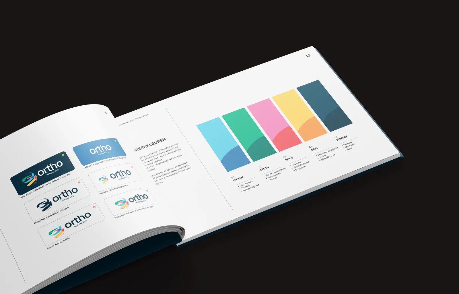
The brand book open at the brand colours: the logo rules on the left, the five swatches from cyan to dark on the right.

Brand identity

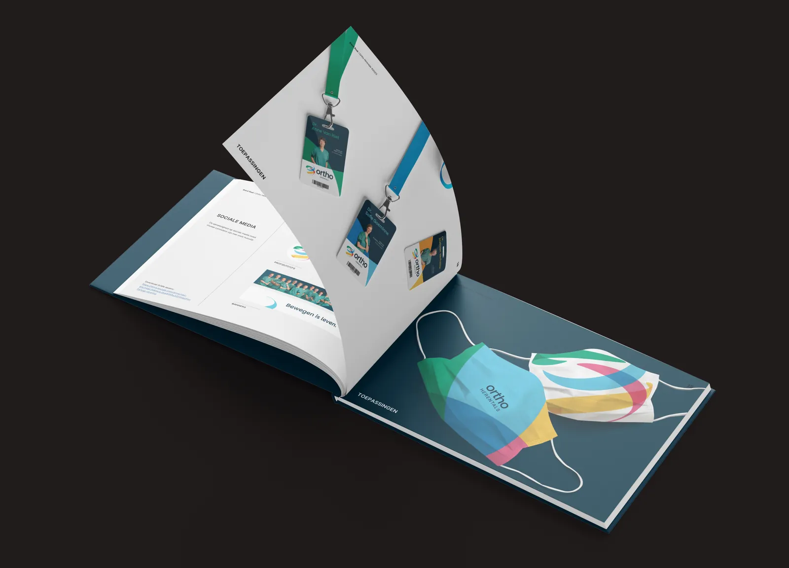
The brand book open at the applications: the lanyard badges on the turning page, the face masks in the house colours beneath.

Graphic/print design

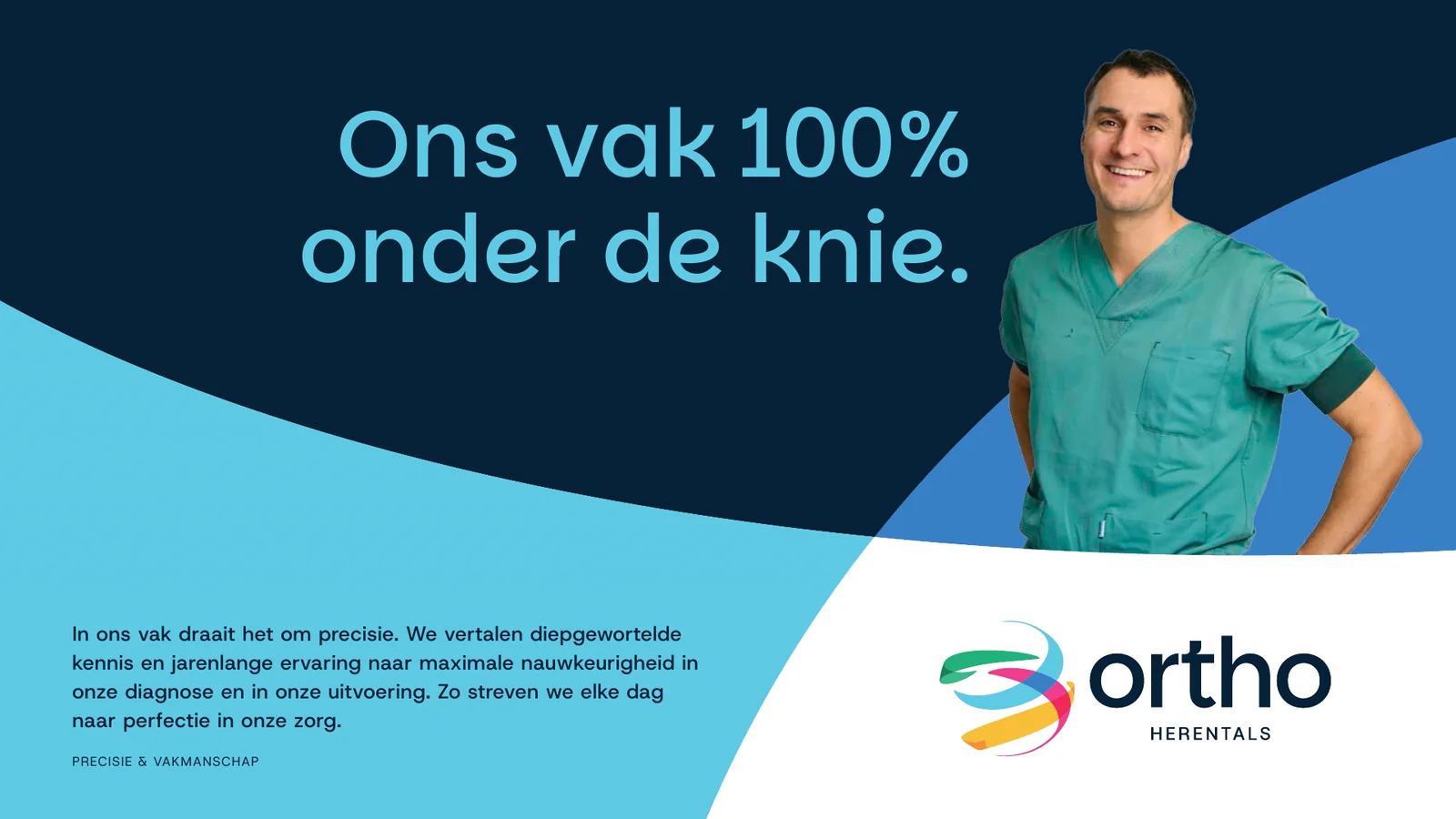
Campaign key visual 'Ons vak 100% onder de knie.'

Graphic/print design

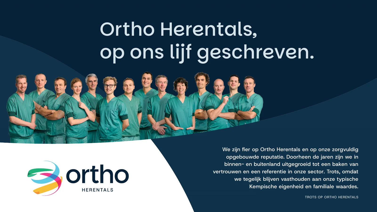
Campaign key visual with the full team: 'Ortho Herentals, op ons lijf geschreven.'

Graphic/print design

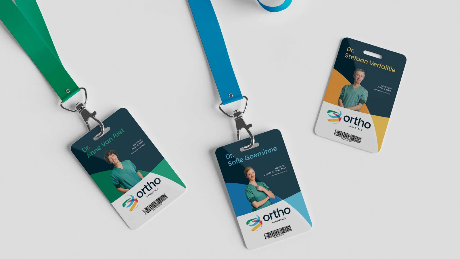
Lanyard badges, one per specialist in their own house colour.

Graphic/print design

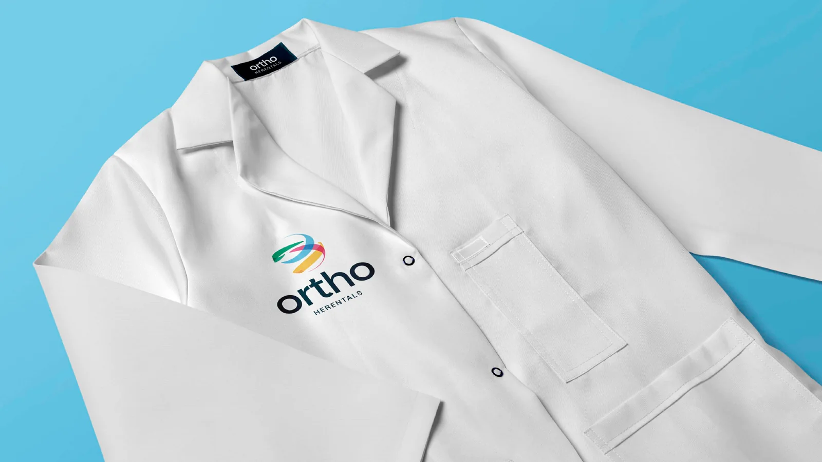
Lab coat with the logo embroidered on the chest.

Graphic/print design

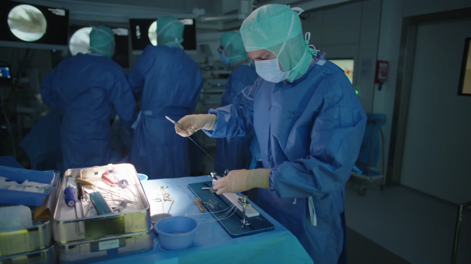
Frame from the image film: a surgeon at the instrument table in theatre.

Video

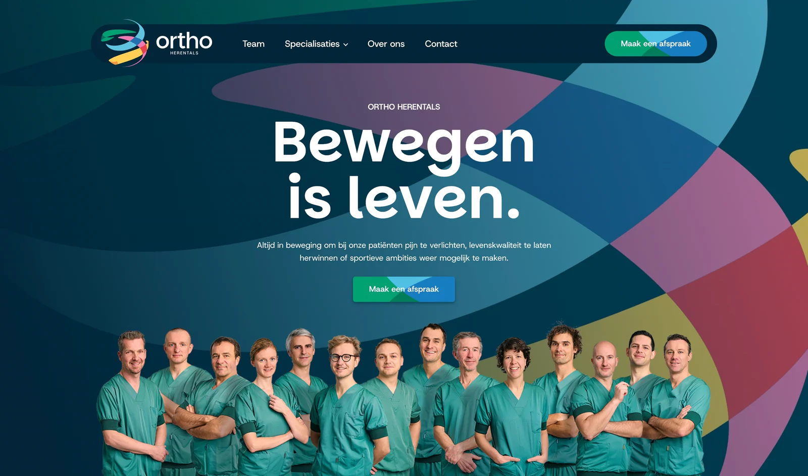
The orthopedieherentals.be homepage: 'Bewegen is leven.' above the full team.

Website

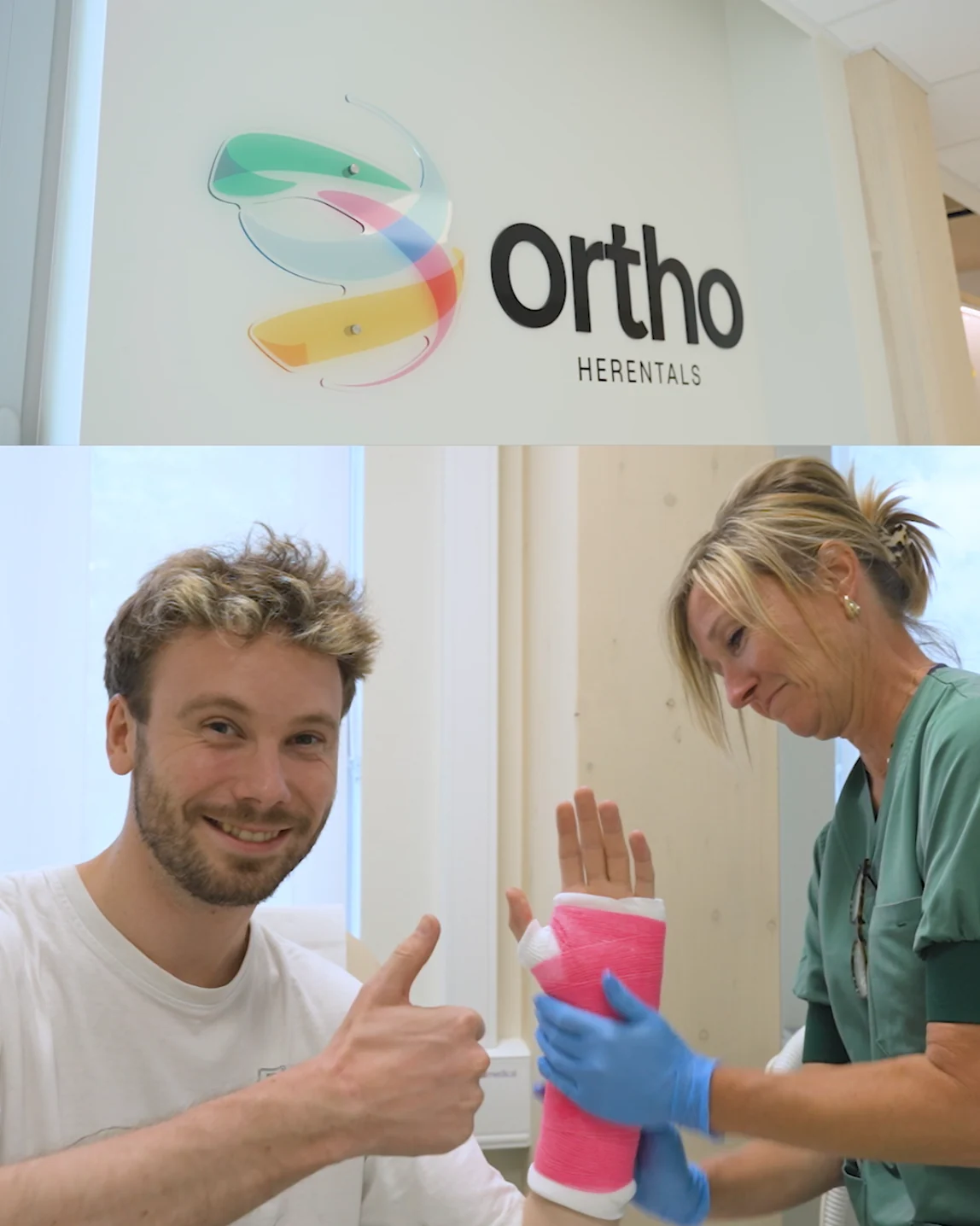
Social post: the corridor signage above a patient giving a thumbs-up to his fresh cast.

Social media

The result

Watch the film